Users were opening multiple tabs because they couldn’t find the built-in comparison tool. Making it visible kept them in a single-tab experience and moved them toward booking faster.
The Impact
- 5x reduction in drop-offs during decision-making
- 2 Millions in additional sales in first 6 months
- Single-tab experience replaced multi-tab chaos
A small UX fix with massive business impact. By making the comparison feature visible and intuitive, users stopped abandoning the process and started converting.
The Problem
Choosing a hotel in a big city is overwhelming. Users want to compare options before booking. Trivago had this functionality — but it was hidden.
The “compare” action lived behind a heart icon on hotel images. Hearts signal “like” or “save” — not comparison. Users expecting a favorites list got a comparison sidebar instead. Confusion, hesitation, drop-off.
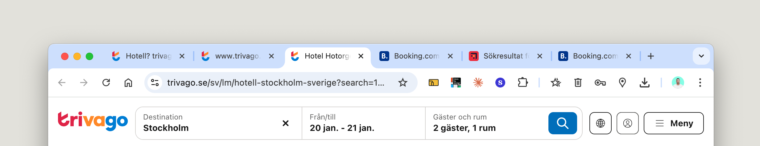
When users didn’t find the comparison feature, they opened multiple tabs. More cognitive load. More abandonment. Fewer bookings.
The Insight
Hidden functionality creates workarounds. Workarounds create friction. Friction kills conversion.
A clearer visual metaphor — a “compare” button, a checklist, anything but a heart — could signal the action properly. UX clarity at this micro-level directly impacts revenue.
The Solution
I proposed a progressive series of improvements:
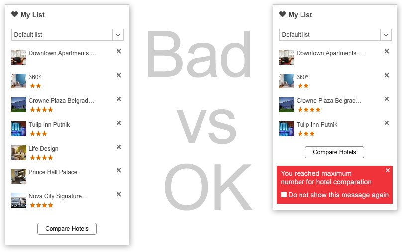
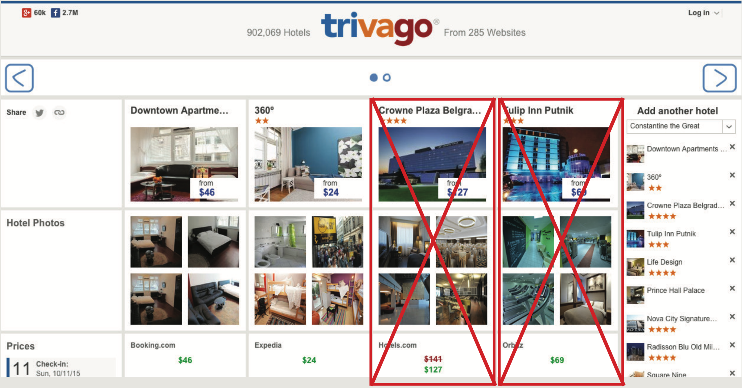
Clear feedback on limits When users hit the 4-hotel comparison limit, show it explicitly. Red indicator below the fourth hotel. No guessing, no confusion.
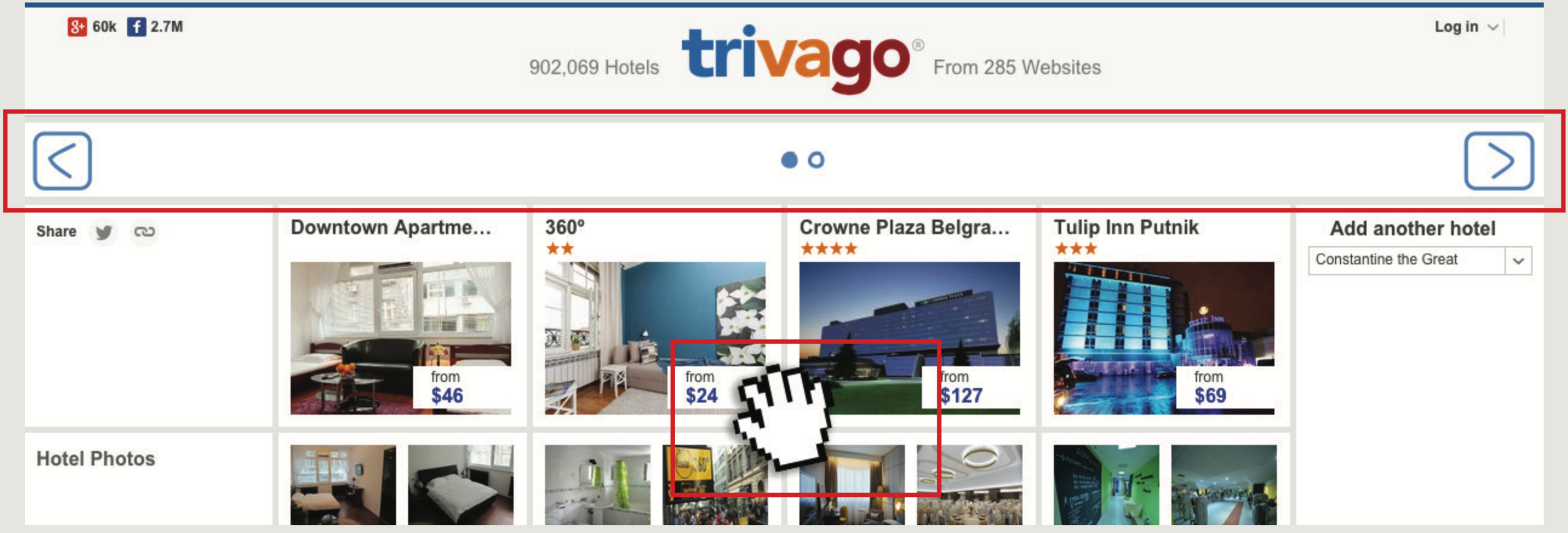
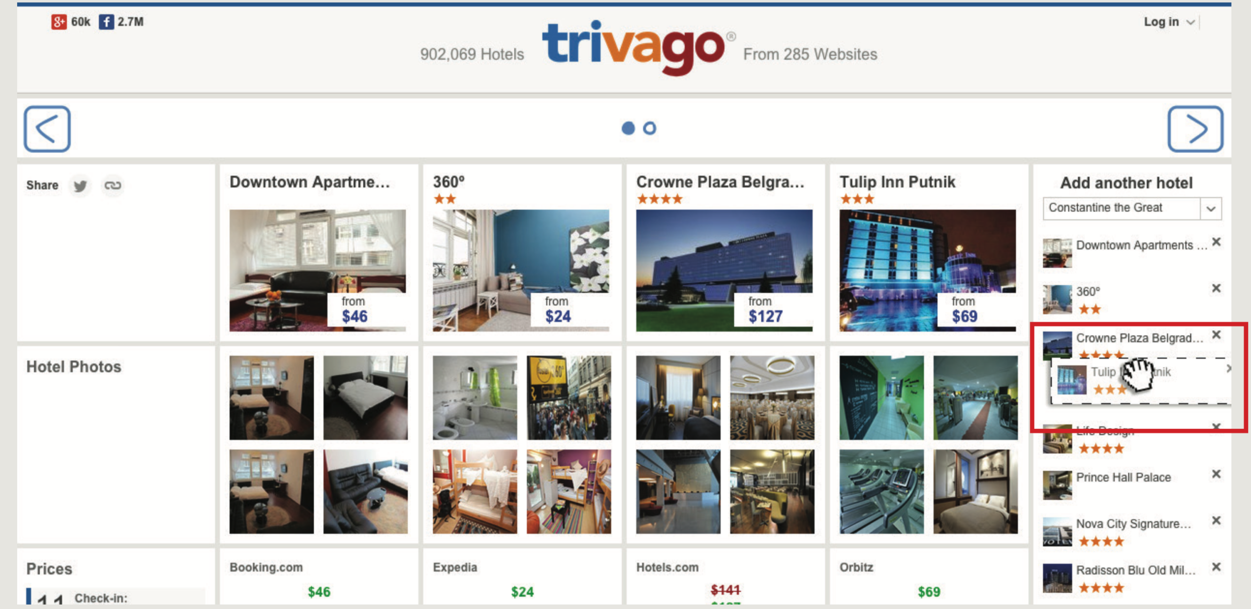
Expandable comparison view Wrap hotels in rows of 4 with carousel navigation. Swipe support for tablet and mobile. Users can compare more without losing context.
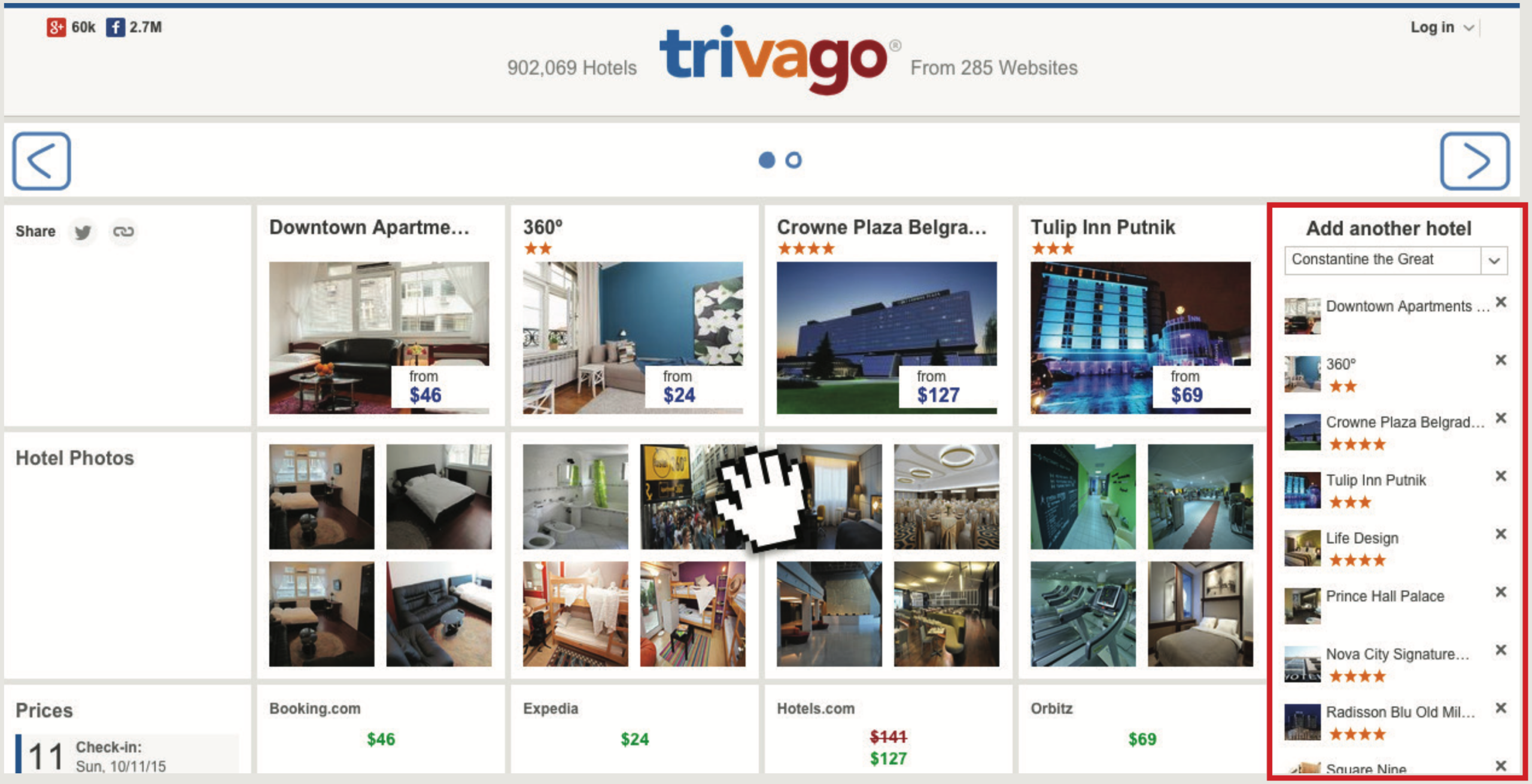
Sidebar mini-list Show selected hotels in a persistent sidebar. Users always know what they’re comparing without scrolling back.
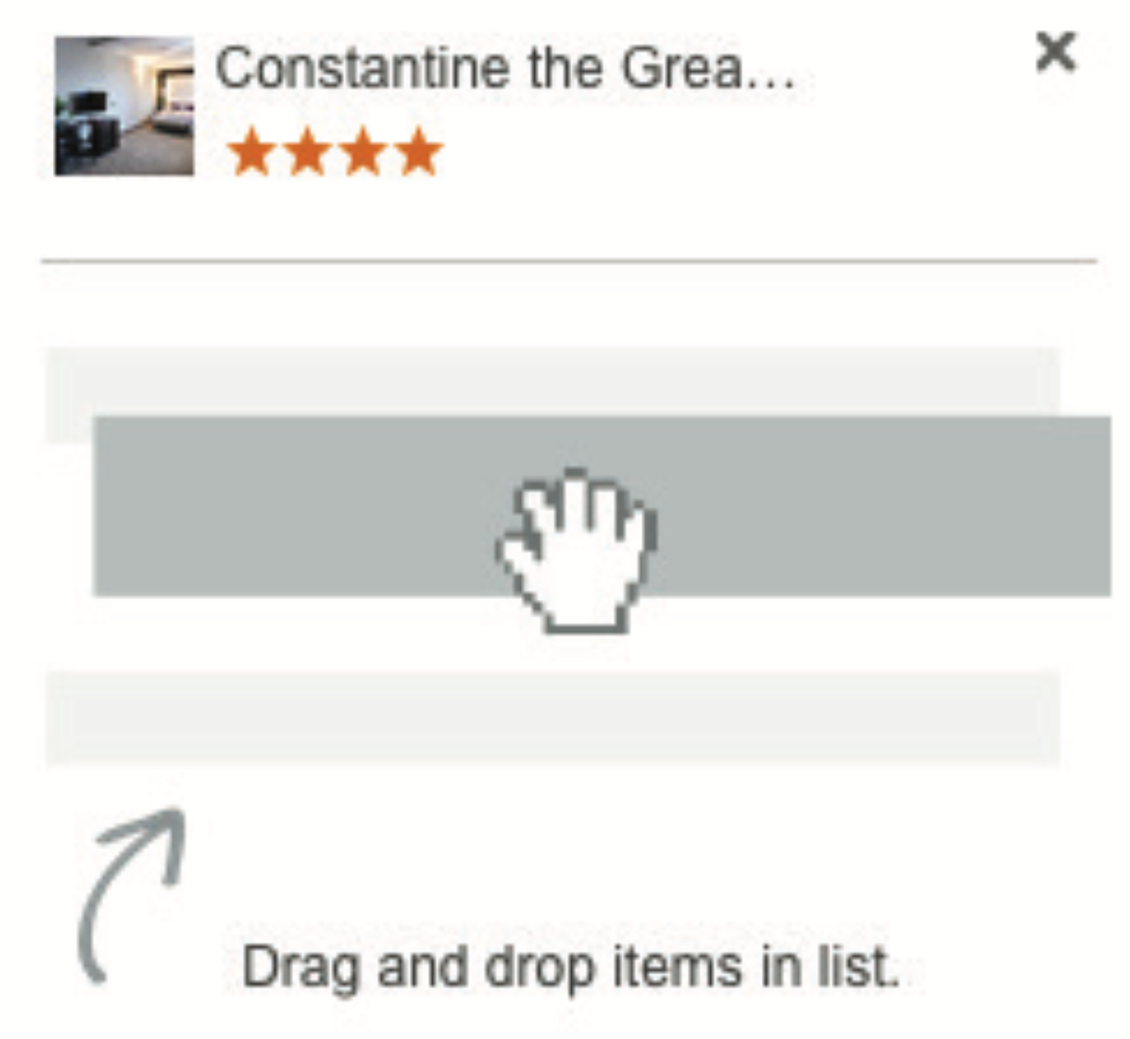
Drag and drop Let users reorder comparison items. More control, less friction.
Illustrated tutorials For less experienced users, add simple visual guidance showing how comparison works. Reduce learning curve.
Responsive adaptation Scale the grid: 4 columns on desktop, 3 on tablet, 2 on mobile. Consistent experience across devices.
Results
Drop-offs during decision-making decreased by 5x. Users stayed in a single tab instead of juggling multiple browser windows. The smoother experience improved retention and conversion — generating millions in additional sales.
A small UX improvement. Massive business value.