Users landed from search, couldn’t find what they needed, and bounced. Pen-and-paper research showed us why: the corporate site tried to say everything and said nothing. Department micro-sites fixed that.
The Impact
- 7x higher conversion than company’s main website
- SEO visibility improved through focused content
- Multiple departments each with dedicated micro-site
- Clear user paths replacing corporate maze
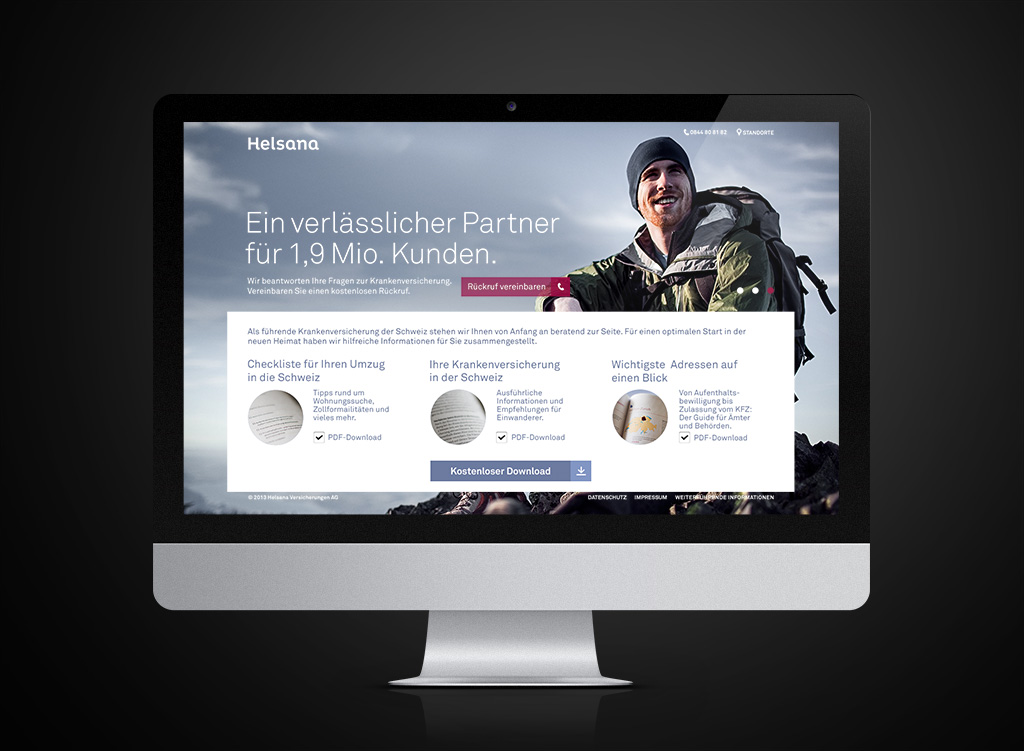
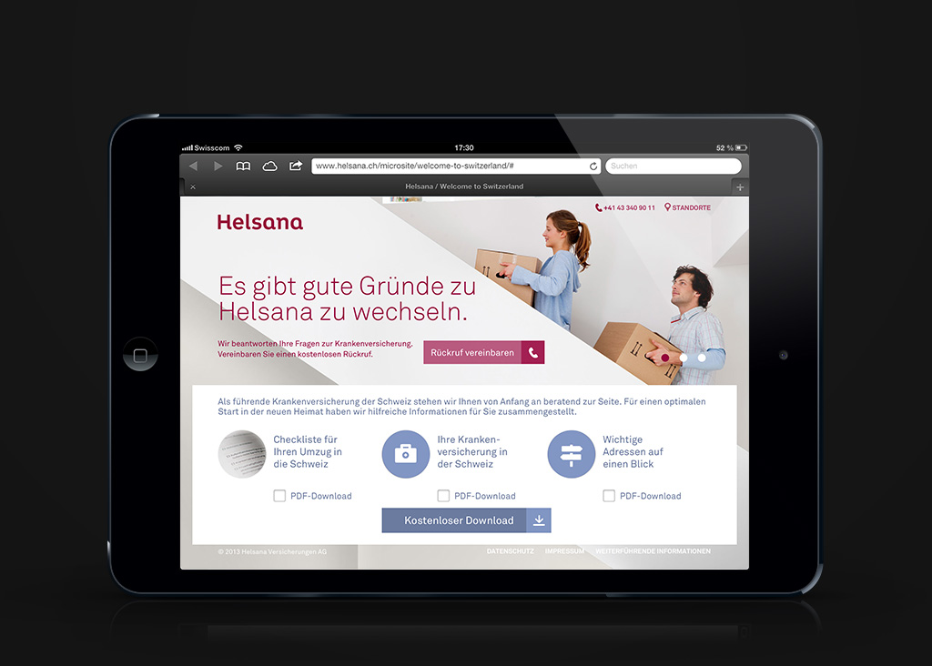
Helsana’s main site was too broad for users to find what they needed. Focused micro-sites gave each department a clear voice — and converted 7x better than the corporate homepage.
The Challenge
As one of Switzerland’s largest health insurance companies, Helsana needed Helsana is one of Switzerland’s largest health insurance companies. Their corporate website was too broad — users couldn’t understand what support was available or which department to contact.
The goal: a series of micro-sites, each dedicated to a specific department. Clear value propositions. SEO-optimized content. Direct paths to the right people.
The Process
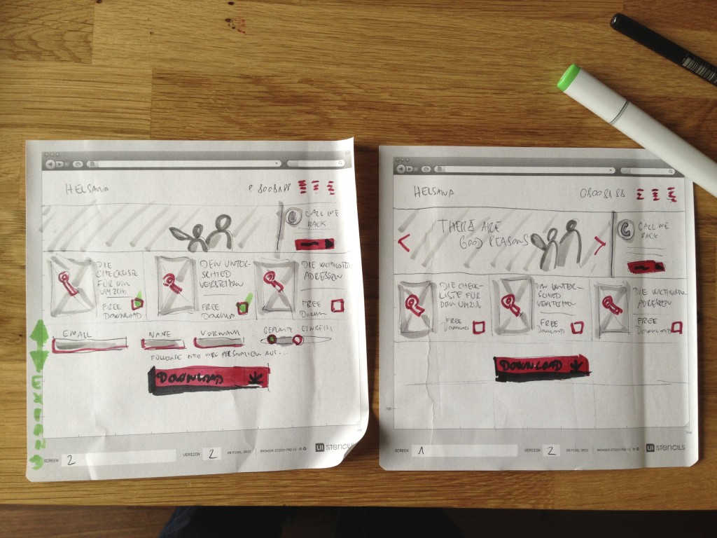
Before jumping into design, we conducted in-depth user research to Before designing, we ran in-depth user research to understand where people got stuck. This was before Figma or Sketch — we went old-school with pen-and-paper testing, in-person interviews, and observational research.
What we discovered:
- Users didn’t understand what different departments actually did
- Contact points and service details were buried
- Organic search traffic bounced because content was too vague
These insights drove everything: simplified navigation, service-focused headlines, direct contact pathways.
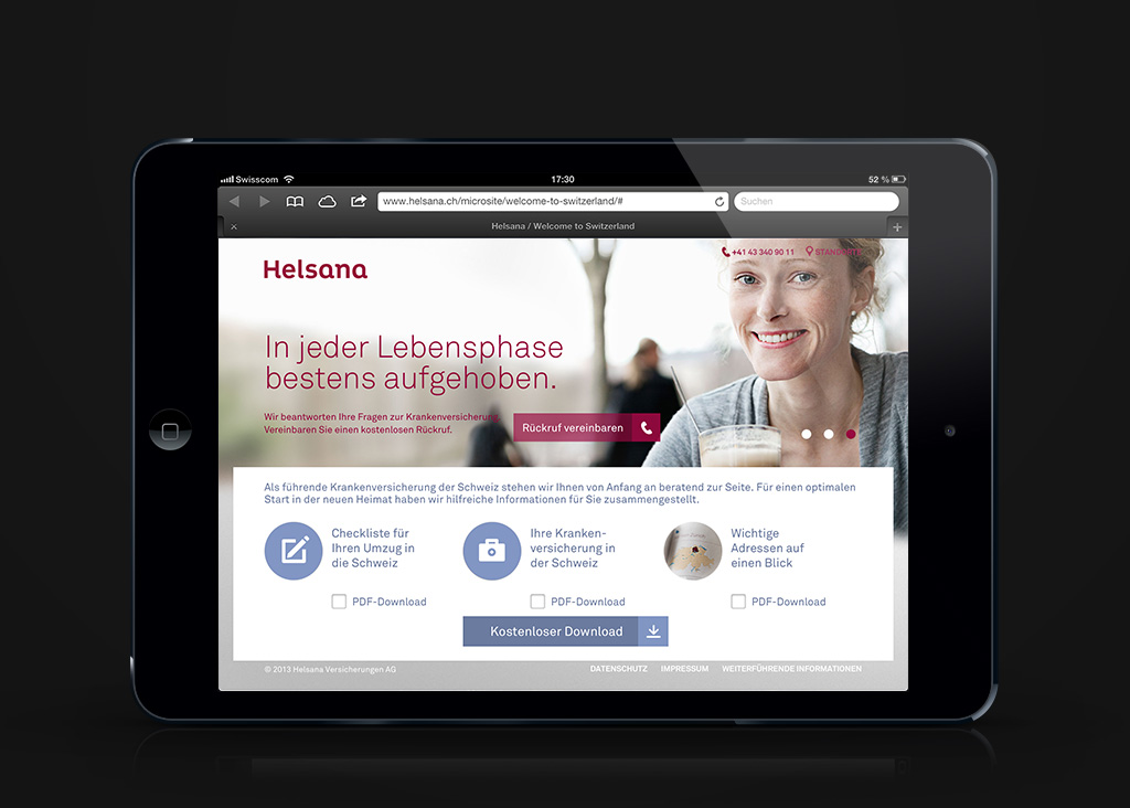
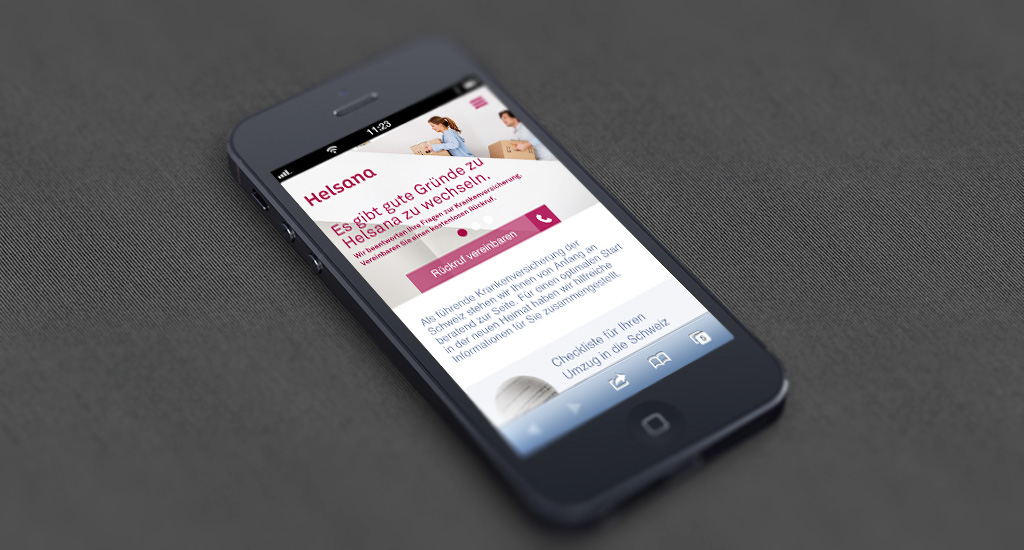
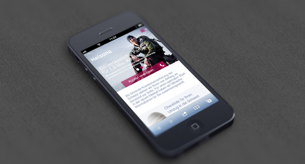
The Solution
A series of micro-sites — one per department. Each site spoke directly to user intent:
Clear value proposition — what this department does, in plain language.
Service-focused content — specific offerings, not corporate fluff.
Direct contact paths — users find the right person without navigating a maze.
SEO-optimized — each micro-site ranked for department-specific searches.
Results
Conversion rate jumped to 7x higher than the main corporate site. By simplifying the path and speaking directly to user intent, Helsana turned confused visitors into engaged customers.
Proof that clarity beats comprehensiveness.