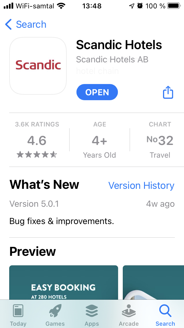
The Scandic app was failing its users. Within months of the redesign launch, ratings more than doubled — the result of fixing real pain points, not just visual polish.
The impact
- 2.3 → 4.6 App rating improvement achieved on App Store
- + 7000 monthly downloads increase
- 3x increase in mobile check-in usage
The app went from one of Scandic’s weakest touchpoints to one of its strongest. Ratings more than doubled within months of launch — not from visual polish, but from fixing the real problems users had with booking, check-in, and navigation.

Background
Scandic is the largest Nordic hotel chain. Their app had a 2.3-star rating. Users were frustrated — inconsistent design, poor accessibility, fragmented journeys. The brand had loyalty; the app was losing it.
My Contribution
I led the complete design transformation — research through execution. The work centered on three things:
Making it accessible. Accessibility wasn’t a checklist item. It shaped the design system, the user flows, the entire product. A hotel app serves everyone — business travelers, families, guests with disabilities.
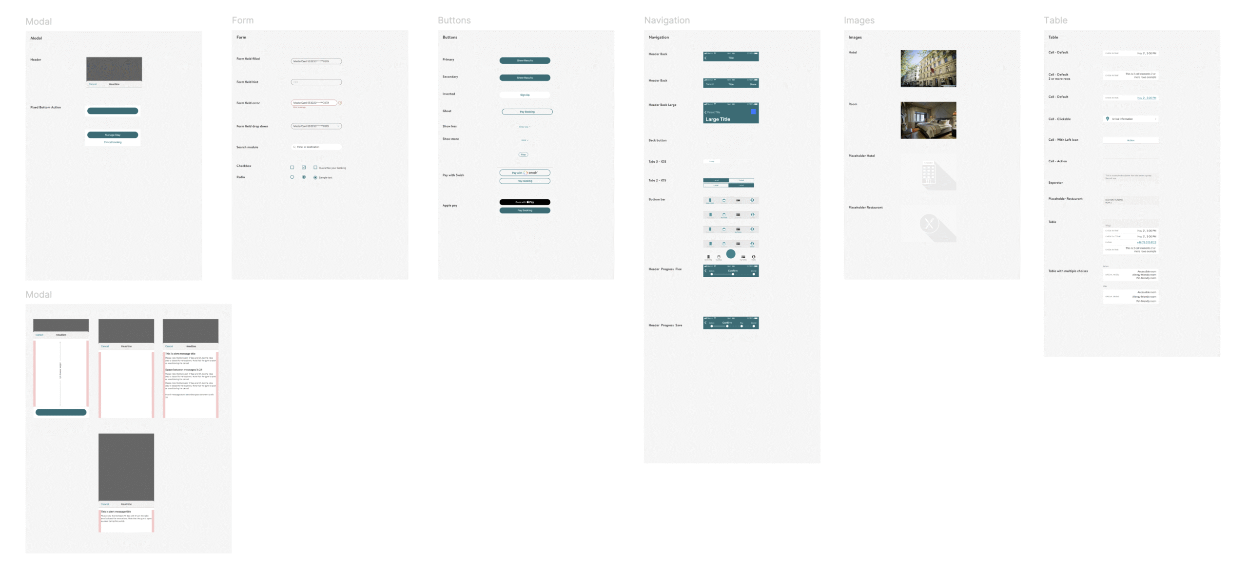
Building a system, not screens. I created a modular design system that unified iOS and Android, sped up development, and kept quality consistent as features scaled.
Testing before building. Interactive prototypes went to stakeholders and users before any code. We caught problems early and aligned fast.
Process
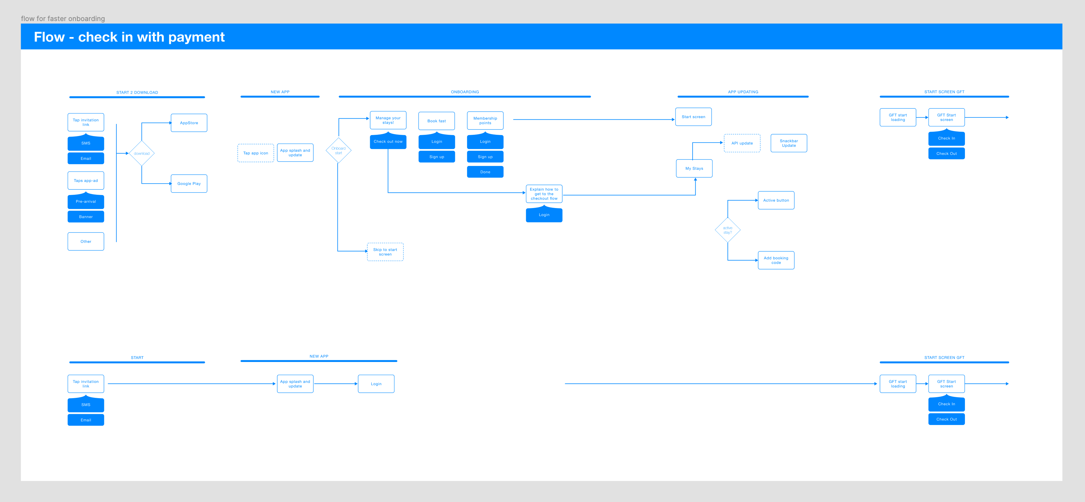
I mapped the entire app — every screen, every flow — to find where users got stuck and where patterns could be reused. This audit revealed the mess: inconsistent components, dead ends, accessibility gaps.
From there, I rebuilt with a module-based approach. Each component designed once, documented, reusable. The design system became the single source of truth.
Full flow audit.
Uncovering friction, creating reusable components.
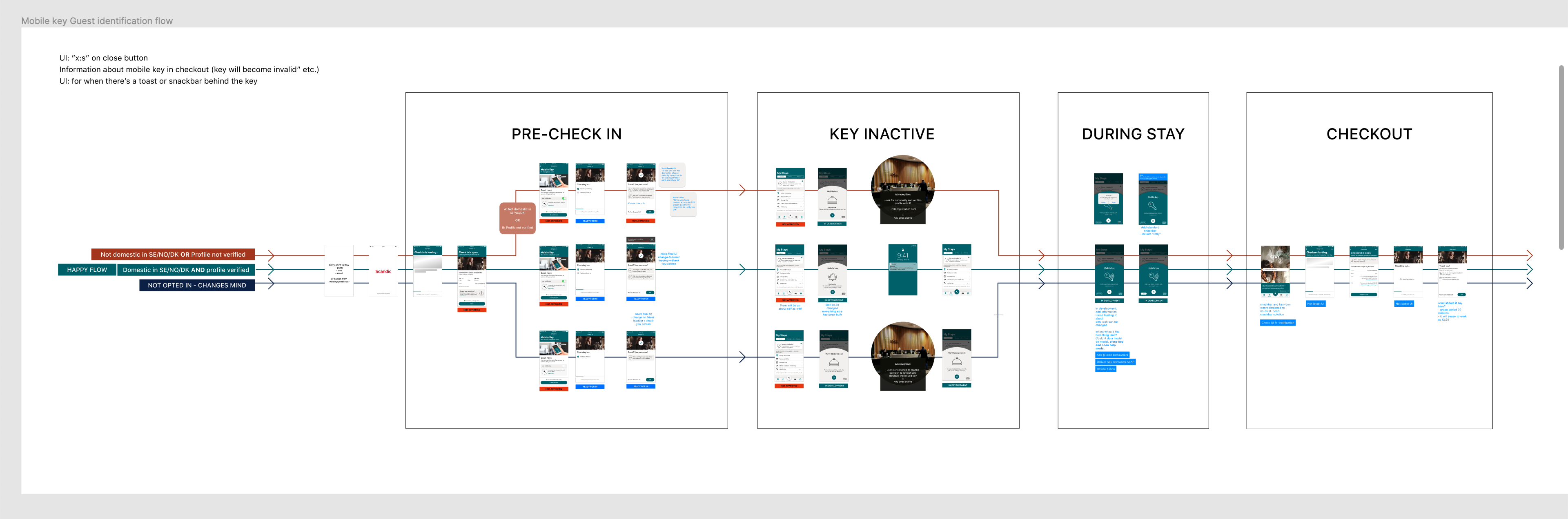
Scandic App user research
Micro-interactions
Details matter in hospitality apps. I prototyped transitions and micro-interactions — skeleton loading, checkout flows, error states — to make the app feel responsive and polished. These weren’t decorative; they reduced perceived wait time and guided users through complex flows.
UI Design
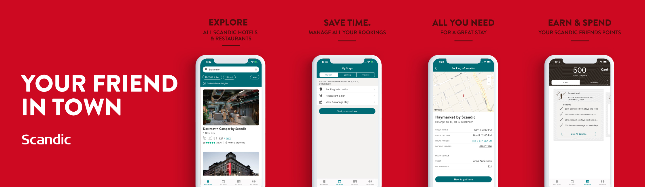
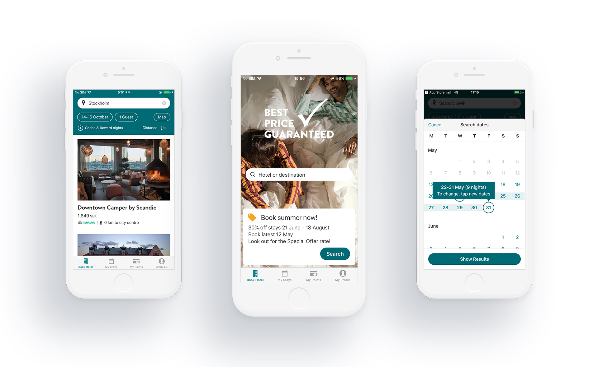
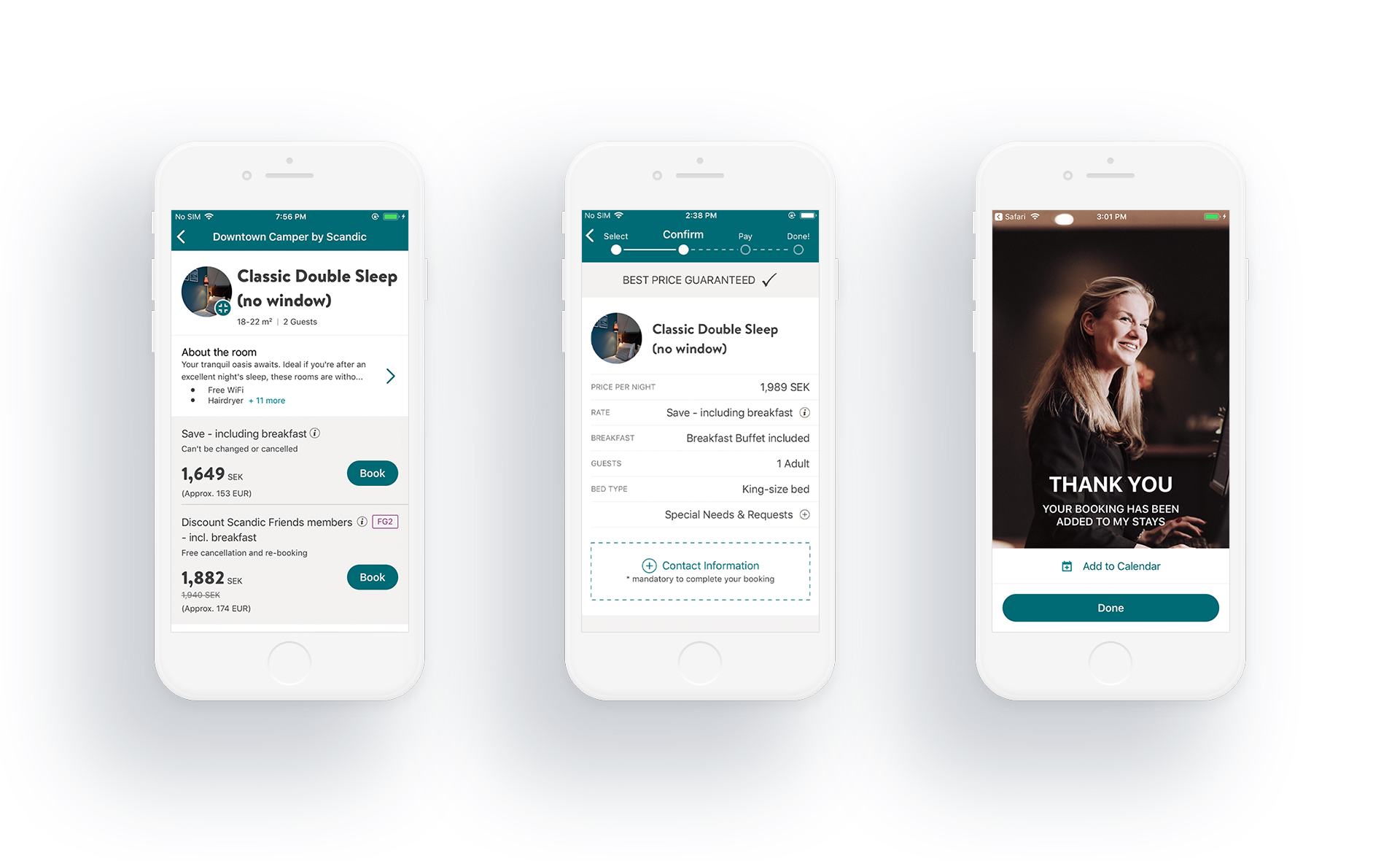
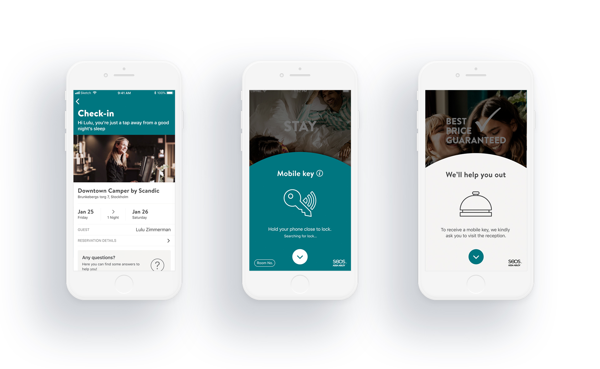
The redesigned app brought together a refreshed UI, accessible components, and streamlined flows. Key screens — booking, check-in, mobile key, checkout — were rebuilt from scratch based on user research findings.
Reflection
A 2x rating improvement doesn’t come from new colors. It comes from understanding why users were frustrated and systematically fixing it. The design system made the product better and made the team faster — that’s the real win for long-term product health.