I still remember the first time I came across the term “User Experience Designer”. It was years ago, embedded in the email signature of a friend of mine—someone whose job I never quite understood. So I asked him.
His answer fundamentally changed how I designed websites from that day forward. Not because of what he actually said (he mumbled something about usability and research) but because of the ongoing discussion that ensued. That discussion prompted me to dig deeper into the world of UX, re-evaluate my processes, and dramatically shape my career.
While many designers hear a description of the term “UX” and reply, “Oh, that’s what I’ve been doing all along—I just didn’t know it was called that”, I was different. Before learning the term “UX Designer” even existed, my design process was arrogant; my designs looked pretty but often missed the mark. Much later, when I chose to adopt the term as my own job title, I felt confident that I had grown measurably as a designer, and evolved my processes to the point where I was worthy of the title.

Such is the power of a phrase. UX may be a buzzword, but that’s not necessarily a bad thing for those of us who design for the web. The principles, philosophies and techniques of which UX design is comprised are well established, and the good news is this: anyone can learn them.
So what does a User Experience Designer actually do? Well, there’s no typical day, however there is a grab bag of techniques that many UX Designers rely on at various stages of a project. I’ve expanded on a few of those techniques here, using panels from a short comic that appears in Everyday UX, an ebook containing interviews with 10 prominent UX designers:
Wireframes
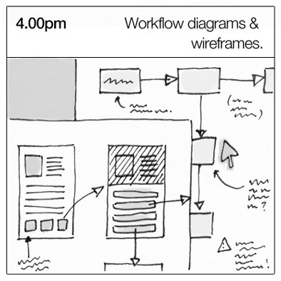 A wireframe—a rough guide for the layout of a website or app—is the deliverable most famously associated with being a UX Designer.
Once created by designers as a series of static images, these days tools like Balsamiq Mockups and Axure RP make it straightforward to evolve your wireframe into an interactive prototype without writing any code.
While many UX Designers make a point that they are more than just wireframe machines, it’s certainly true that many UX Designers start with wireframes: creating a basic site layout is something anyone can do, and the tools are easy to learn.
User Testing
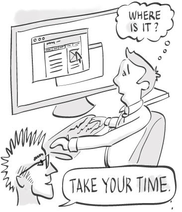 Sitting users in front of your website or app and asking them to perform tasks you’ve planned for them while they think out loud is the fundamental premise of user testing.
How many test participants you involve, how closely your test participants match your actual users, and how many iterations of testing you run are all decisions shaped by budget and time constraints.
User testing is straightforward enough that anyone can—and should—experience running one. Being in the same room while someone struggles to use your product is a powerful trigger for creating empathy with users—a common trait.
Personas
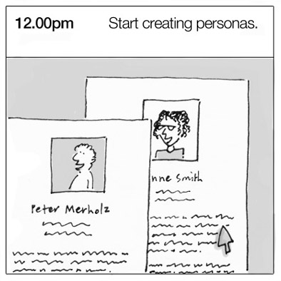 A persona is a fictitious identity that reflects one of the user groups for whom you are designing.
Personas need to be informed by research to be useful. It can be tempting to put on your creative writing hat and invent details to make them believable or interesting. However, the goal should be to have your personas reflect patterns that you’ve identified in your users (or prospective users).
There’s no shortcut for identifying these patterns—they come from user research: conducting interviews, surveys, user testing, contextual inquiry and other activities.
Scenarios and Storyboards
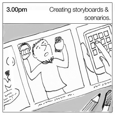 A scenario is a narrative describing “a day in the life of” one of your personas, including how your website or app fits into their lives. If you’re familiar with writing user stories in an agile environment, you’ll be comfortable writing scenarios—although the focus here is on regular usage, not edge cases.
Depending on the audience, a storyboardmay be a more appropriate tool for capturing how, when, where and why someone might use your product.
Inspired by the filmmaking industry, a storyboard is a visual sequence of events used to capture a user’s interactions with a product.
It may be an extremely rough sketch—purely for crystallising your own ideas—or a more polished comic for engaging your audience more effectively.
Conclusion
This is just a sample of the hundreds of techniques that UX designers have available to them to ensure they get the right design—and the design right.
The trick to applying them is learning when to use which technique.
But that’s a topic for another day …
