Warehouse teams ditched their disconnected Excel files for a single real-time platform.
The impact
- €4M monthly gain with +80%
- 8x Boosted shipment speed
- 20% faster app delivery through design system foundation
Warehouse teams ditched their disconnected Excel files for a single real-time platform. Shipping got 6x faster. Daily logistics workflows improved 4x. The system delivered an estimated €4M monthly business impact within two months of launch.
Problem
Electrolux ran logistics through spreadsheets. Different teams maintained different files. Nobody had the full picture. As scale increased, errors multiplied. Warehouse staff, support teams, and leadership all needed real-time visibility into inventory, repairs, shipments, and rentals — but the tools didn’t exist.
System Mapping & Architecture
Before touching pixels, I mapped the entire system — inventory flow, rental lifecycle, repair handling, shipping logic, backend integrations. This surfaced hidden dependencies and operational bottlenecks that wouldn’t show up in stakeholder interviews alone. The map became the architecture blueprint.
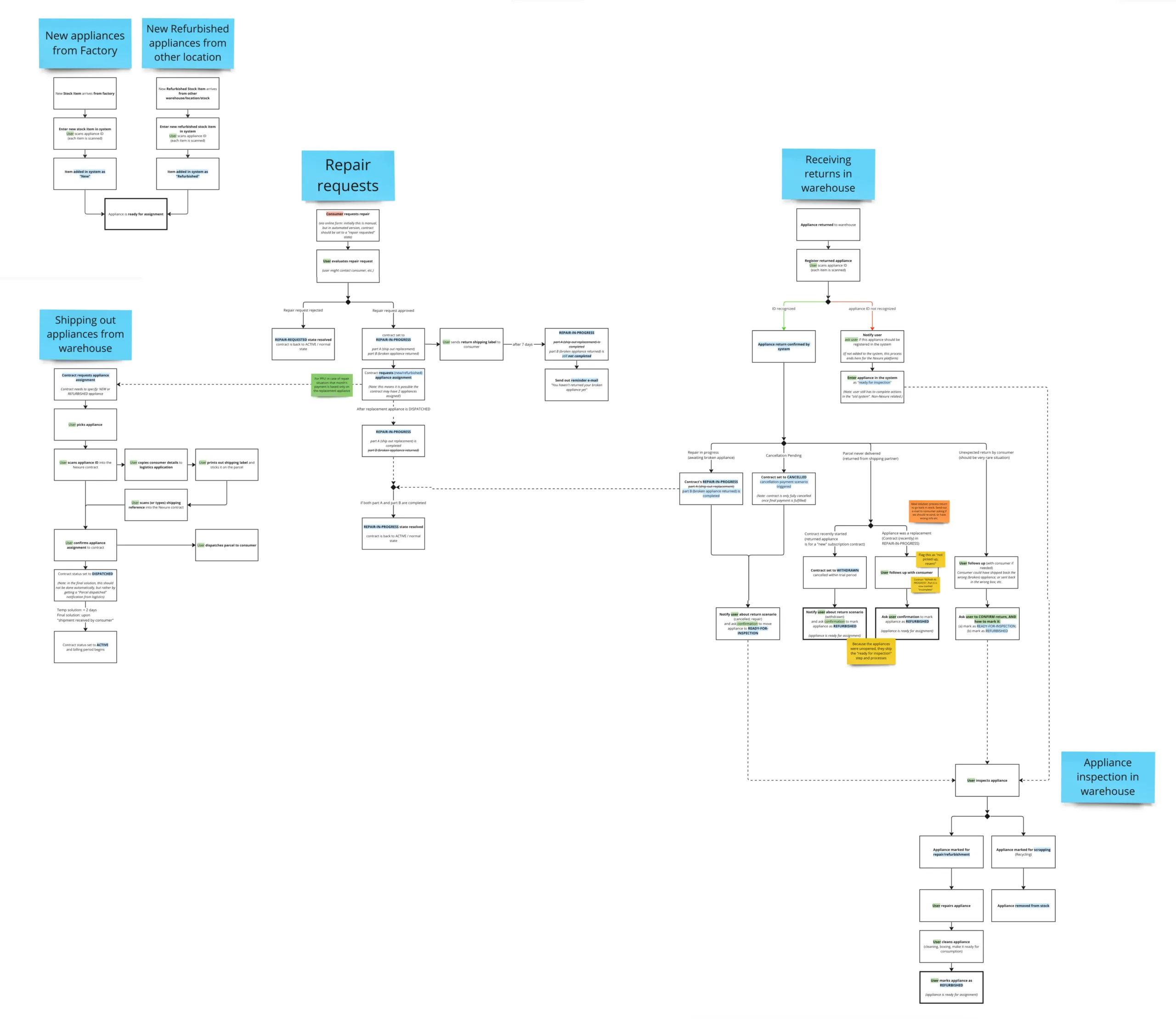
Process
I started in the warehouse. Literally. Observed operators under fluorescent lights, managing devices with gloves, dealing with poor connectivity. Those physical constraints shaped every interaction pattern — button sizes, contrast ratios, information density.
Wireframes
From there:
- stakeholder alignment
- flow definition
- iterative wireframes
I built a design system alongside the product to keep development tight and consistent.
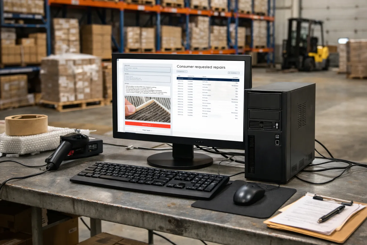
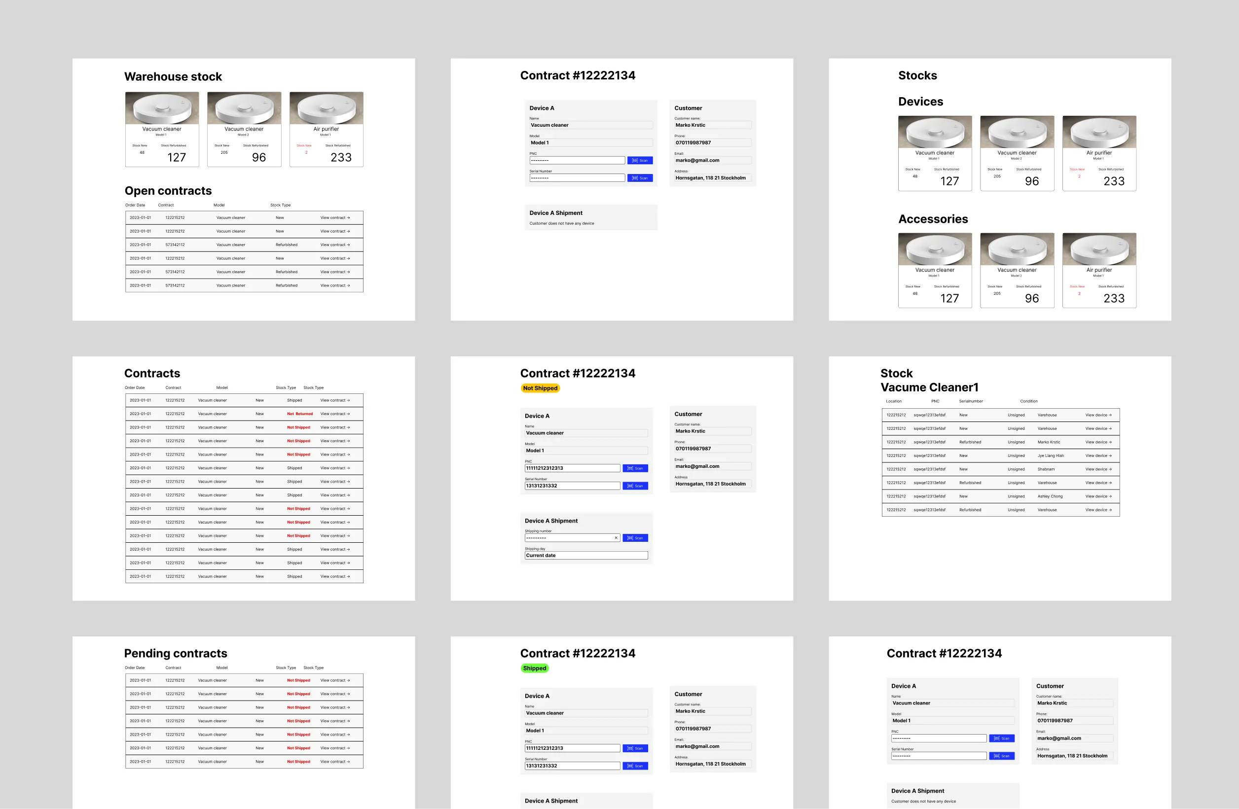
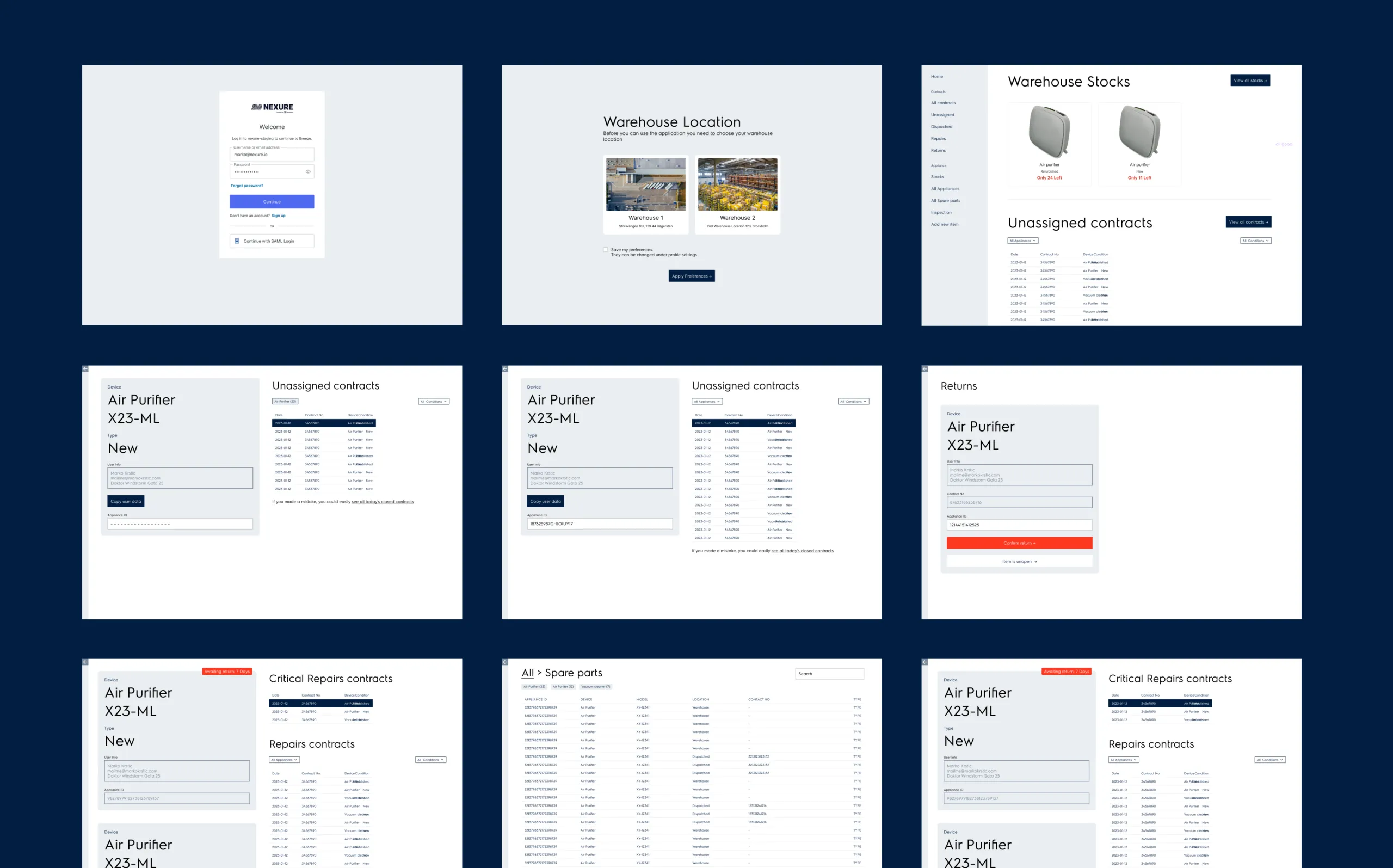
Solution
A single platform replaced the spreadsheet maze. Inventory, shipments, repairs, rentals — all unified. High-contrast interfaces built for warehouse lighting. Real-time dashboards that show system status at a glance. The backend now connects directly to the marketing site, closing the loop from warehouse floor to customer communication.
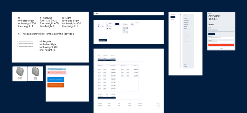
Design System: Built for Warehouse Conditions

Warehouse staff don’t work in ideal lighting. Screens compete with fluorescent overheads, natural light from loading docks, and glare from reflective surfaces. A standard UI would fail here.
I designed a minimal, high-contrast system from the ground up:
High contrast as the baseline — not an afterthought. Dark backgrounds with bright status indicators. Large, legible type. Color used functionally, not decoratively.
Reduced visual noise — every element earns its place. Dense information displays without clutter. Clear hierarchy so operators find what they need in seconds, not minutes.
Consistent, reusable components — buttons, tables, status badges, form inputs all follow the same rules. This kept the interface predictable for users and sped up development handoff by 20%.
The design system wasn’t a separate deliverable — it was the product. Every screen inherited the same contrast ratios, spacing rules, and interaction patterns. When new features were needed, the team could build them without redesigning from scratch.
UI Design
With simple design system
Reflection
Designing for real environments beats designing for screens. Understanding time pressure, poor lighting, and gloved hands changed everything about how I approached this UI. System mapping was the hidden MVP — it prevented architectural rework that could have cost weeks.