Inherited a fragmented design team and disconnected platforms. Built a unified design system that bridged developers and designers — winning Sweden’s Best Hotel Site two years running.
One of the hardest projects start,
was definitely Scandic Hotels.
Impact
- 2 Awards won in a row for Best Nordic Hotel Website.
- 40% saved on maintenance by rolling out design system.
- €2M saved in 6 months through A/B testing
What started as chaos — disconnected platforms, no shared system, solo designer — became a Nordic award-winning product. The design system unified five platforms, doubled the app rating, and cut maintenance by 40%.
Problem:
The design was fragmented. Two style guides for web, built by two different people. App disconnected from web. iOS disconnected from Android. Four designers had worked in silos — shared features and brand consistency suffered.
Collaboration was harder because everyone used Sketch with no shared system. There was no single source of truth.
Approach
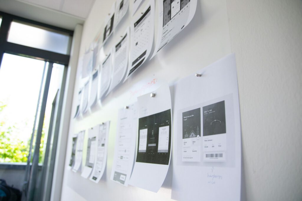
I started with a wall. Literally — printed every screen from the app and website, pinned them in the developer area. Suddenly the gaps were visible. Inconsistencies you’d miss in files became obvious at scale.
That wall became a meeting point. Developers started bringing each other over, pointing out what existed on one platform but not another. Eventually they’d call me over when they spotted opportunities. The wall turned into collaboration.
Since I was the only designer, I had to work in tools developers already used. Jira became our shared space for tracking design decisions — not just dev tickets.


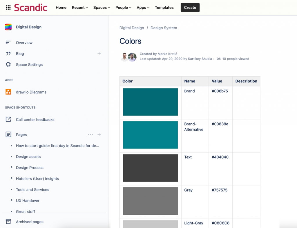
Colors Cleanup Process
The color cleanup had one goal: less chaos, faster work. Fewer resources on third-party requests. Easier onboarding. Better accessibility tracking. Less code, better performance.
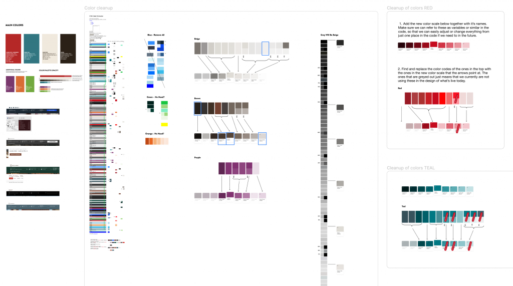
Creating Design System.
For teams not just for me.
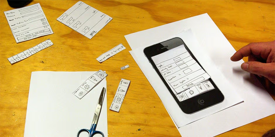
A design system built alone doesn’t get adopted. I ran a workshop (learned from InVision): print every template, have teams slice components with scissors, then group and name them. Four to five people per group.
This surfaced how the team actually thought about elements vs. components vs. templates — and got everyone invested before a single Figma file was built.
Connect designers & developers.
Designers sat in one room, developers in another. They rarely spoke. Designers without coding knowledge felt intimidated approaching devs.
The wall fixed this. Both teams walking through the same screens, same problems. Conversations happened naturally.
A design system customers never see — they see code. Connecting design to development made the system real.
After Each update
Every component update got tested. Prototypes in Figma or Principle, loaded onto real devices, run through user testing. No release without validation.
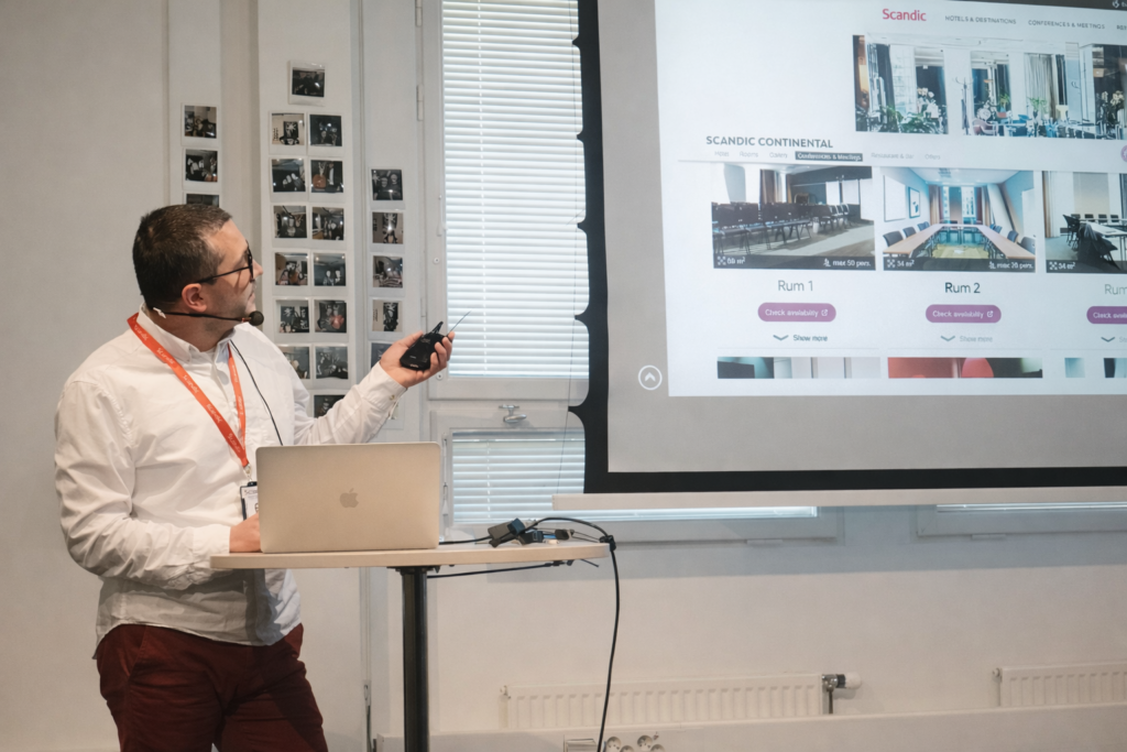
But building the system wasn’t enough — I had to advocate for it. Regular presentations: what changed, why it matters, what’s next. If you don’t talk about it, nobody uses it.
If you don’t talk about it, nobody will know.
Rewards
It takes time to build a solid foundation — but once it’s in place, the results start to show.
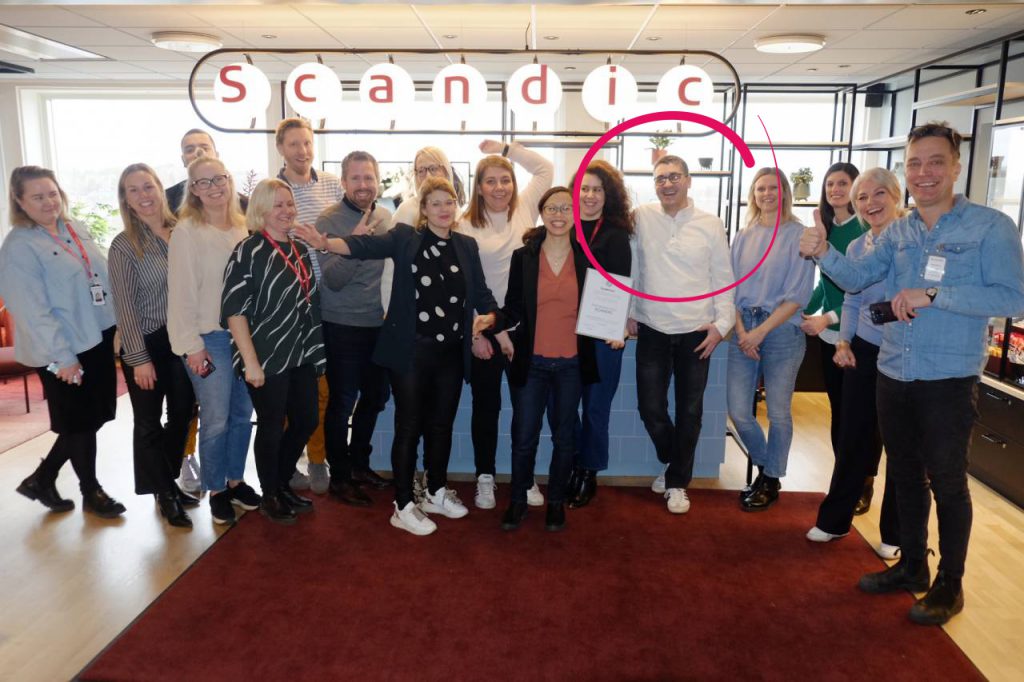
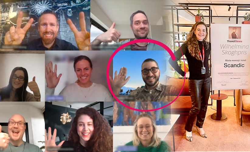
- 🏆 Sweden’s Best Hotel Site — two years running (Travelnews.se)
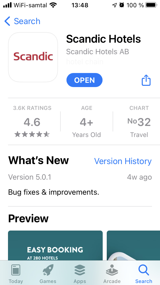
- 📈 App Store rating: 2.3 → 4.6
The foundation took time. The results proved it was worth it.
