Brief:
At HelloFresh, our aim is to make cooking enjoyable and approachable for everyone. Our emphasis is on delivering quality ingredients and delicious recipes to our customers.
One of the biggest challenges that the HelloFresh website faces is to clearly communicate what we do to uninformed visitors. Our customers especially have trouble understanding that we have a subscription model and the exact pricing of a product they are getting.
Instructions:
- UX/UI Design: How would you improve the homepage design to properly communicate the service to visitors and lead them to the checkout journey? How would you prioritize the layout of the content between explanatory copywriting, displaying products and emphasising our value and business model to our customers?
- UX Strategy: One of the most important brand values of HelloFresh is to become a cooking companion and help people be inspired and excited about food.
Add a new feature or change an existing feature that you think doesn’t fulfil what the company stands for in order to better incorporate this brand value. Think of the touchpoints which this feature will fit in the user journey.
I wouldn’t touch a thing. This is great.
Said no designer ever!
In today’s world web technology is not a holy grail with which you finish one and go to another project.
Brand reflection is a never-ending story. After the wheel of business has turned forward, processes go in circles with constant reviews, analyses, and bending according to the needs of clients.
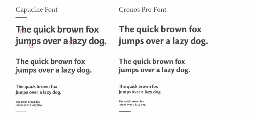
Readability
By choosing the Cronos font, which has straight lines, we avoid blurry capitals in the font on non – retina devices. Besides sharp capitals (Stem) we have curvy endings which give a happy note to it.
Consistency
Do not confuse the customers.
I start from an assumption that the majority of people visiting your website have a lot of work and no time for thinking.
Let’s choose one color for the clickable things.
On the current website, the confusing thing for me is the difference between visual accent and link.
The biggest inconsistency is the linking of the logo. The upper logo is a link to the home page, while the logo in the footer is not a link.
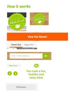
Can you guess 10 out of 10 what is a link on the picture to the right?
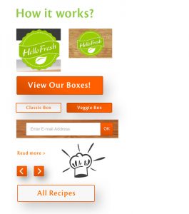
Or is this a little bit easier?
Let’s make all calls to action and links orange.
Let’s take the gray out because it indicates inactive.
Let’s link the logo in the footer to the home page, or change it to the back to the top button on mouse hover.
Grouping the content
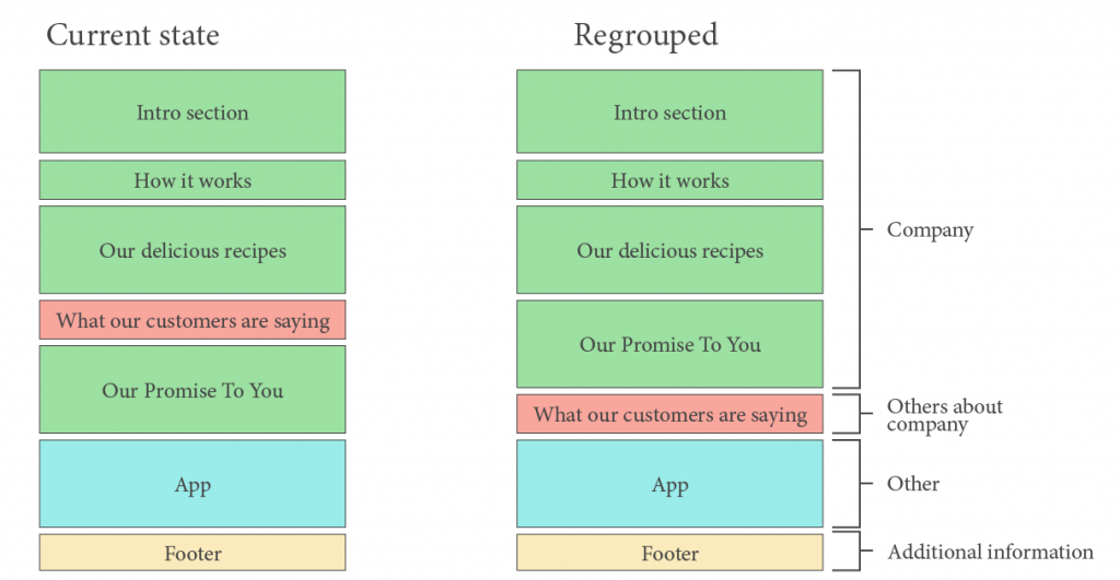
In focus
Intro section
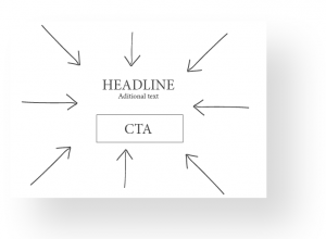
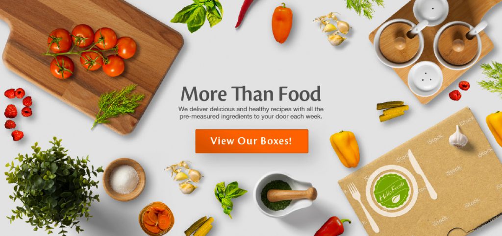
In this part, I have a problem with section 1 because I have two focuses of the same importance.
On the left side, we have got a nice photo which takes our attention off the button. On the right side, we have got a bleak photograph in the background which kills readability. I resolved this by adding a title and a CTA button in the middle and spreading a composition around it.