Impact
- 20–25% increase in customer trust and loyalty through consistent visual identity
- 6 countries unified under one scalable color system
- AAA accessibility achieved with APCA-tested color pairings
- 40% faster design decisions with pre-paired color combinations
A fragmented palette became a single source of truth — eliminating brand confusion across markets and agencies while meeting modern accessibility standards.
Background
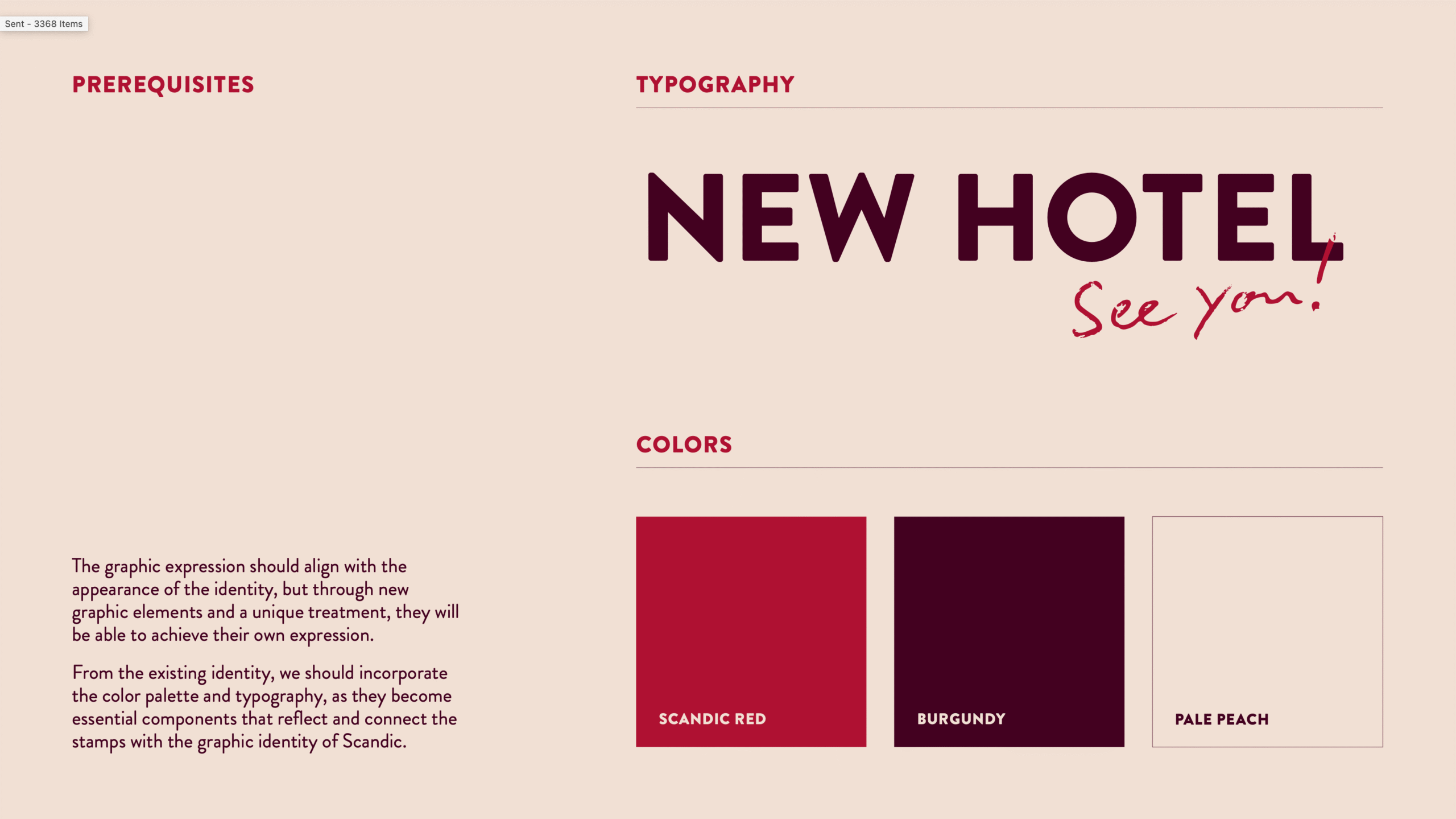
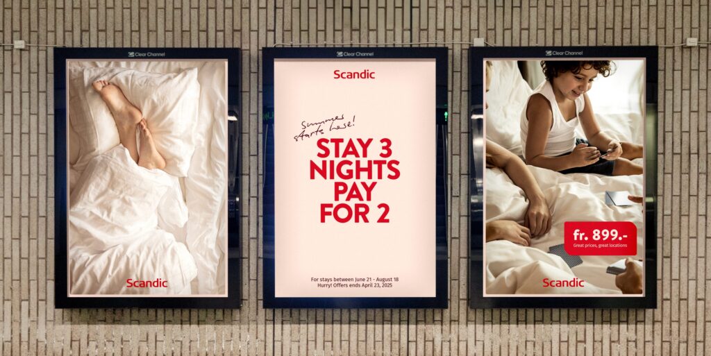
Scandic operates in six countries, each with local agencies interpreting the brand differently. Red was the core color, but everything else was improvised — arbitrary additions, inconsistent pairings, no system.
I redefined the color strategy for print and digital. Pre-paired color sets replaced guesswork — each combination designed to complement the brand while giving teams flexibility.
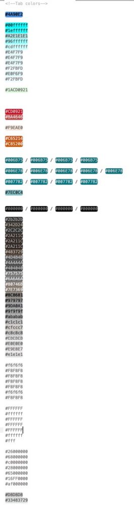
Scandic Colors
Every market had invented their own palette.
This was the starting point.
Brief
The brief was straightforward: create a color system that felt “warm and friendly” (Scandic’s brand essence), worked across print and digital, and hit AAA accessibility. The catch — it had to work for six countries, multiple agencies, and everything from hotel signage to app UI.
Exploration
Accessible doesn’t mean boring. Our guests range from digital-native travelers to older generations — the system had to work for everyone without looking clinical.
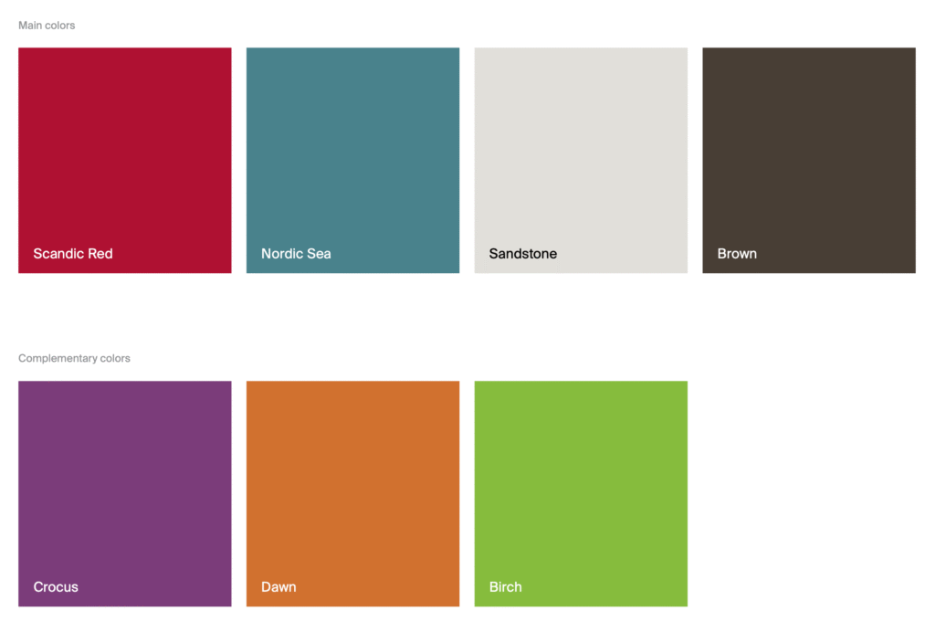
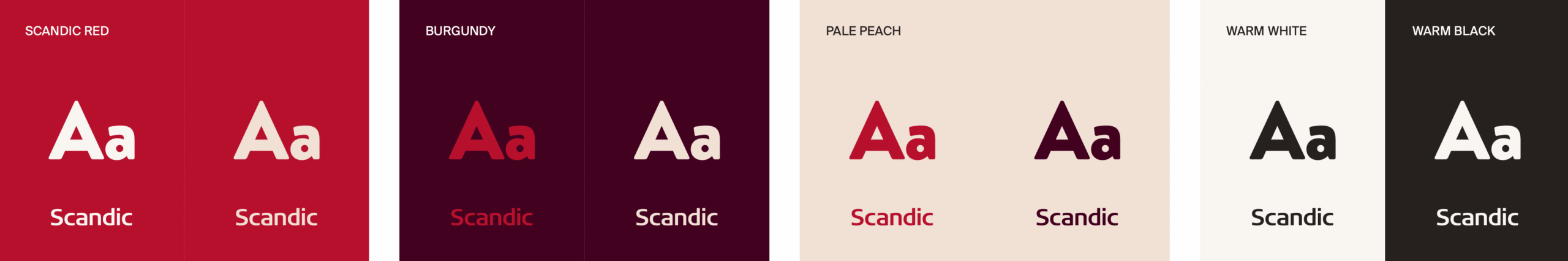
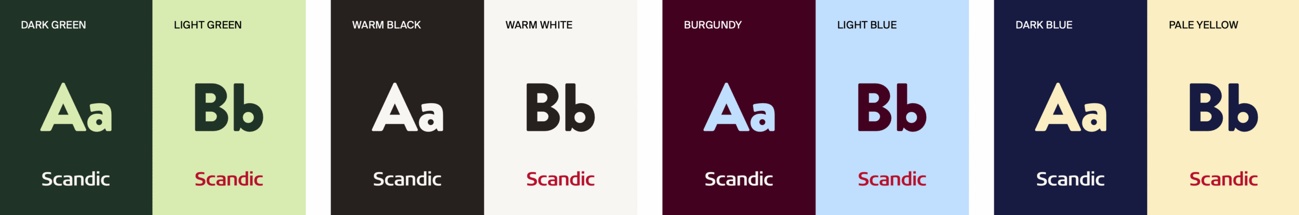
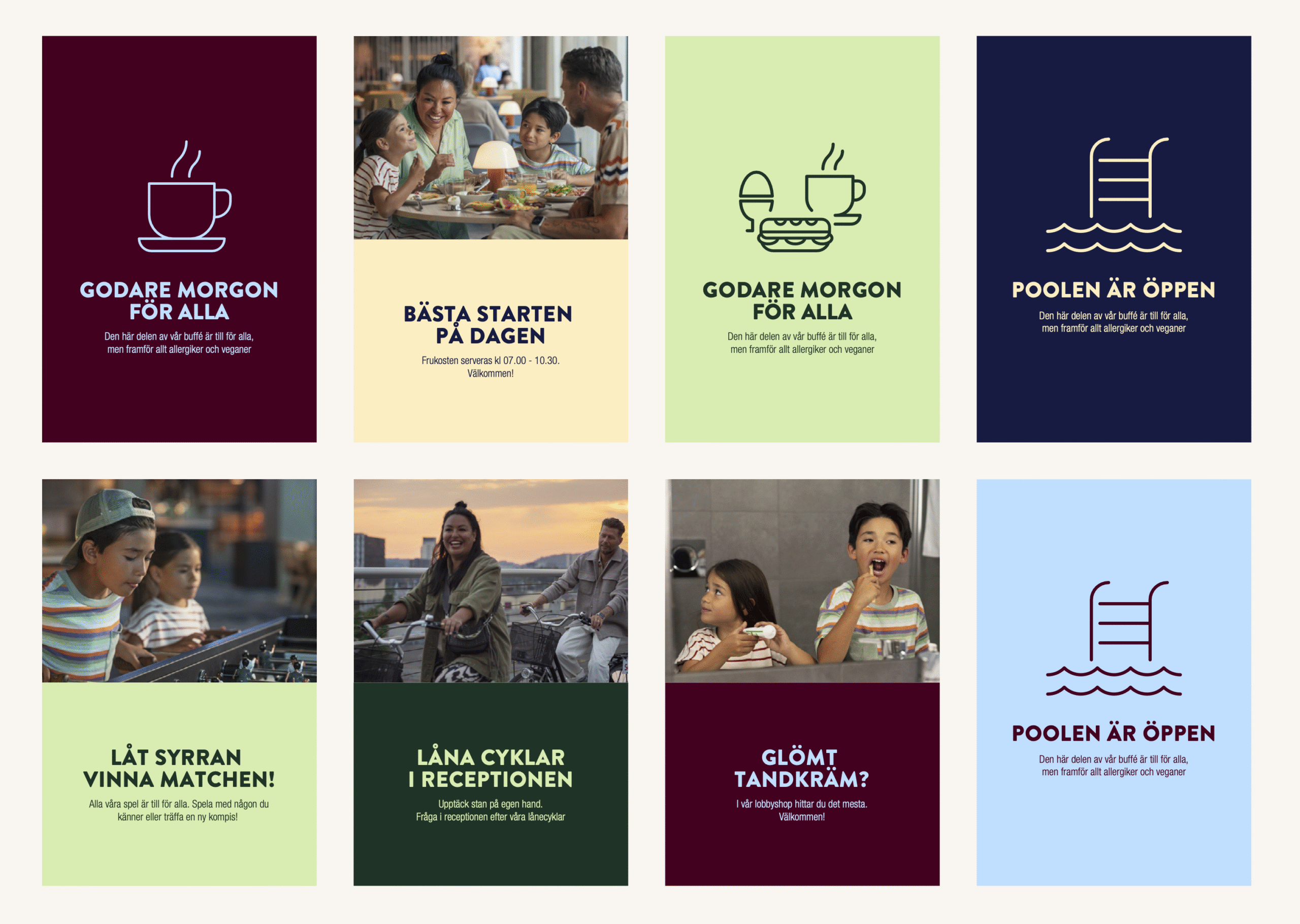
I defined two connected color groups: the core palette (red, white, peach, burgundy) and add-on pairings (greens, blues, warm neutrals). Each add-on was tested against the primary red for contrast and harmony.
SCANDIC MAIN BRAND COLORS
ADD-ON COLOR PAIRINGS
Test, test, test
WCAG 2’s contrast formula is too simple — it often flags combinations that aren’t actually legible. We used APCA (coming in WCAG 3), which factors in how humans actually perceive contrast based on font weight and context.
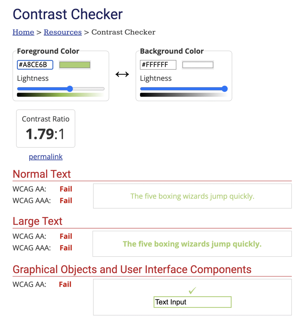
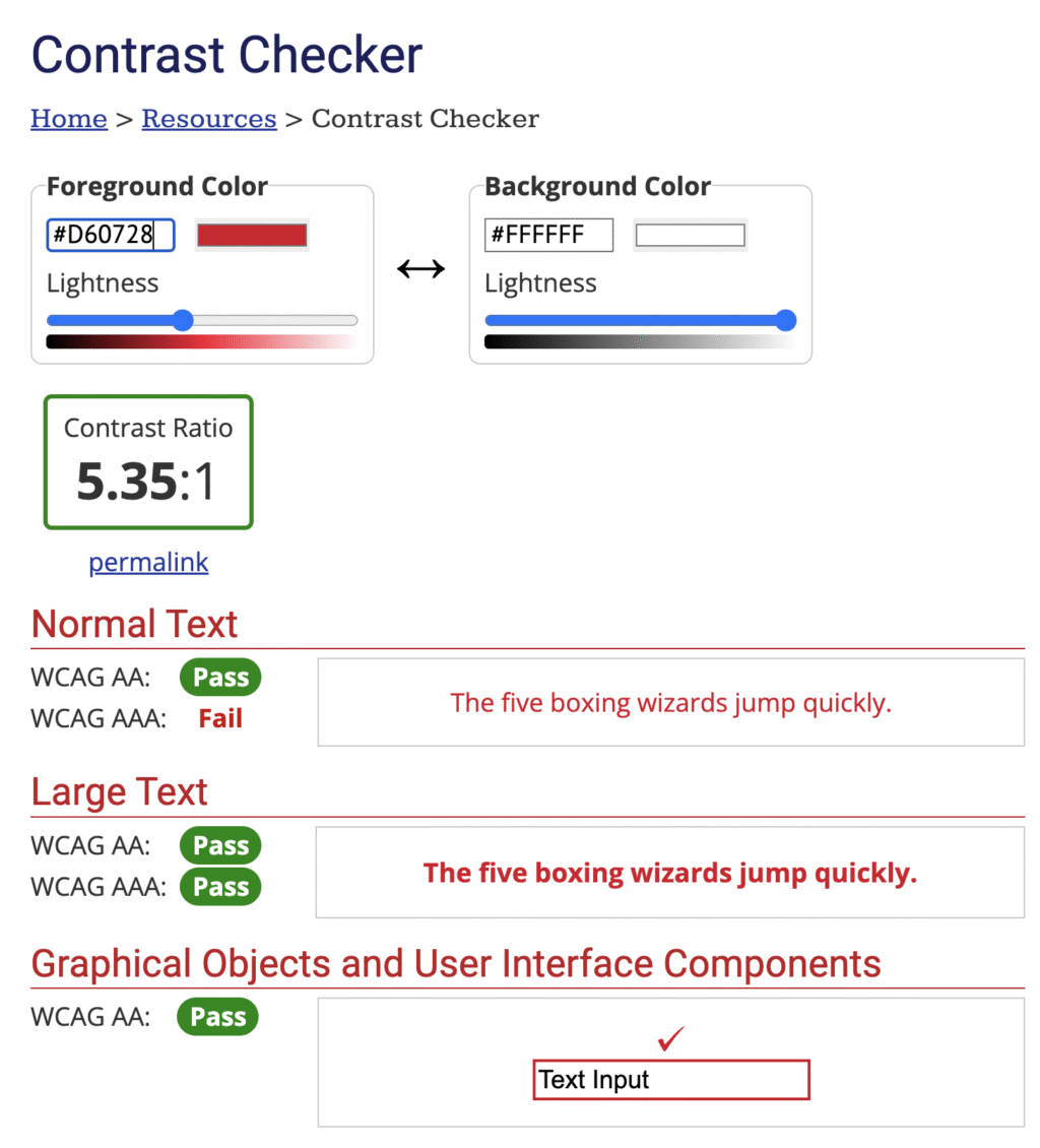
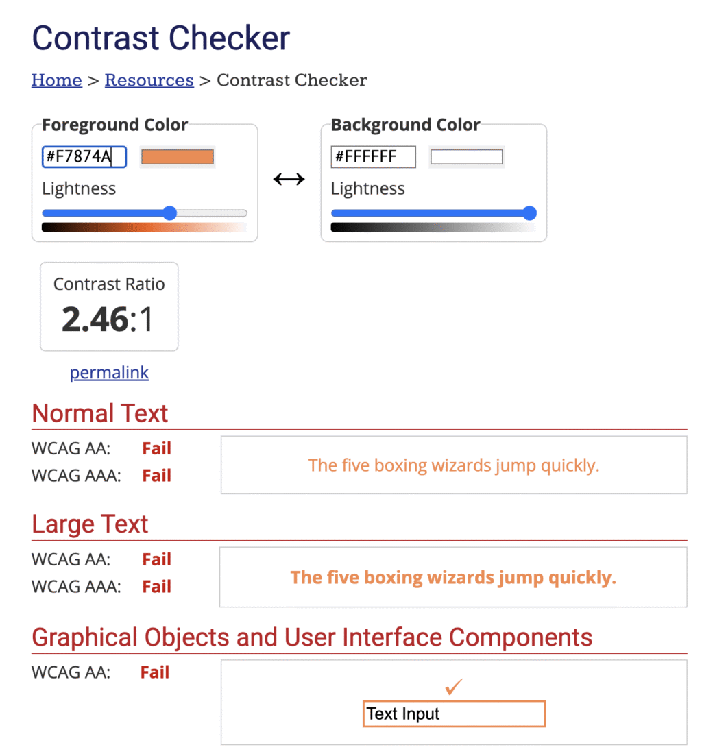
For colorblindness, we ran every combination through Figma’s Color Blind plugin across 8 deficiency types. 300 million people worldwide are colorblind — this isn’t edge-case design.
Colour accessibility isn’t all about maths. Sometimes you just need empathy. According to Colour Blind Awareness, there are approximately 300 million people with colour blindness worldwide. That’s almost the same number as the entire population of the USA. But as designers, it’s not always easy to put yourself in their shoes.
Luckily, there’s a brilliant Figma plugin called Color Blind that does just that. We ran this simulator on our new colour set to see how each colour would appear to colour blind users, then weaved the adjusted shades through key product screens. This helped us to understand how well our new colours were working for the 8 most common types of colour blindness (spoiler alert, it’s not just grey scale).
Top tip — I’d recommend this low vision simulator too. It really helps you simplify designs and see where you need to up the contrast.
Design Testing
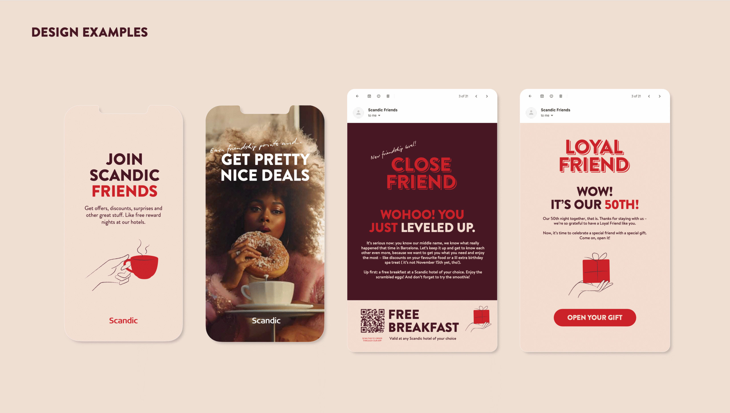
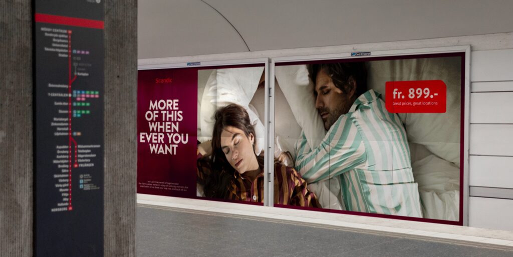
To make a confident final decision, we tested all color combinations across multiple designs and touchpoints — from UI screens to print materials — to ensure consistency, accessibility, and visual harmony in every context.
Final product
The final system: 3 core brand colors, 6 pre-paired add-ons, documented for every use case from app UI to hotel signage.